
Using geo chart reports
Overview
Geo chart reports help visualize how an activity metric is distributed across countries and regions. The metric is plotted on a world map using color-coded shading, making it easier to identify geographic patterns in audience behavior and campaign performance.
They are typically used to understand where contacts are located, which regions drive the most engagement, and how activity volumes differ across markets.
This type of report makes it easy to spot high-performing regions, underrepresented markets, and geographic concentration in campaign interactions and contact behavior.
When to use a geo chart report
You can use a geo chart report when you need to understand the geographic distribution of an activity metric across your audience.
Here are some example cases where a geo chart report can be used:
- Identify which countries have the highest email open or click rates
- Understand where your most engaged contacts are based
- Monitor the geographic distribution of signups or conversions
Creating geo reports
You can create a geo chart report by selecting Analytics > Reports > +New Person/Account Report > Start from scratch > Geo chart report.
When building the report:
- Click + Add metric to select the activity you want to report on.
- Use the table below to configure the report's settings in the editor.
- Select Create to build the report on the account.
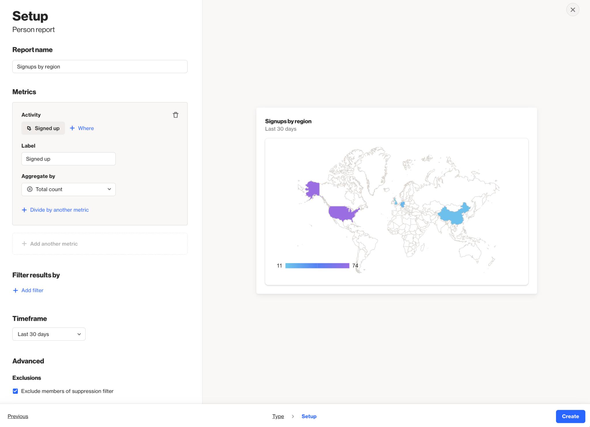
Below is a table of the available setting options for this report:
Setting | Description |
|---|---|
Report name | Sets the internal name of the geo chart report, making it easy to identify in the reports list and dashboards. |
Add metric | Select the activity, contact field, or account field to use as the metric in the report. Learn more about field-based reports. |
+ Where | Add conditions to refine which activities or field values are included in the metric. |
Label | Sets the name for the metric in the map legend and tooltip. |
Aggregate by | Choose how the metric is calculated: Total count or Unique total count. Metrics with number or currency attributes can also be aggregated by Sum or Average. |
Attribute for aggregate | When aggregating by Sum or Average, select the number or currency attribute to calculate. |
Associate by | When using Unique total count, select the attribute that determines how activities are counted as unique. Options include Person (default) and other available attributes. Learn more about uniqueness. |
Divide by another metric | Divide the metric by another to calculate a rate or ratio. For example, divide unique Opened Email by unique Received Email activities for an open rate. Learn more about campaign statistics. |
Display As | When dividing metrics, choose whether the result is displayed as a Rate (%) or a standard value. |
Filter results by | Apply additional filters to limit which contacts are included, such as audience membership, field values, or tags. |
Timeframe | Sets the date range for the report. Only activities within this window are included. |
Uniqueness window | Determines how often the same contact can be counted for the same activity. This prevents duplicate activity events from inflating results within a defined time period. Learn more about uniqueness windows. |
Exclusions | Allows you to remove contacts in your suppression list from your report, such as internal users or test contacts, to keep your results clean and accurate. Learn more about the email suppression list. |
Interpreting geo reports
A geo chart report displays an activity metric plotted across a world map. Each country is shaded according to its metric value, with darker shades indicating higher values and lighter shades indicating lower values.
Countries with no data are displayed in a neutral gray, distinguishing them from regions with recorded activity. Hovering over any country on the map displays a tooltip showing the country name and its metric value.
Understanding the color scale
The color intensity applied to each country reflects its relative metric value within the current dataset. The scale is determined by the minimum and maximum values across all countries in the report:
- Countries with the highest value appear in the darkest shade.
- Countries with the lowest value appear in the lightest shade.
- Countries with no data remain unshaded.
The legend at the bottom of the map displays the value range, providing context for reading the color scale.
NOTE: Geo chart reports depend on geographic data being populated for each contact or account record. If location data is frequently missing, the report may underrepresent actual geographic distribution. Reports are built using existing activity data that depends on each activity's data retention settings. Learn more about data retention.
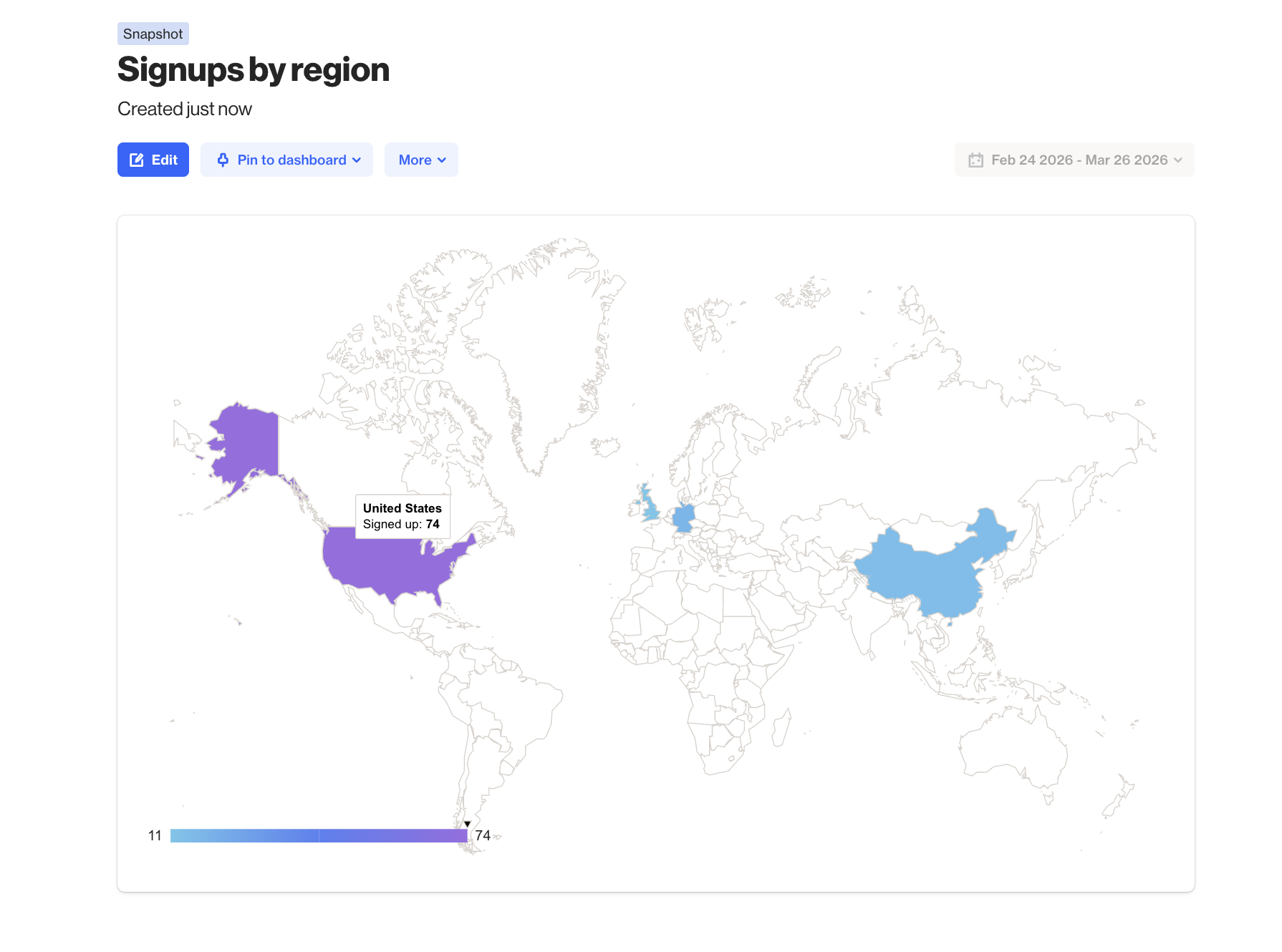
EX: This geo chart report tracks total Signed up activities by country over the last 30 days. The United States has the highest signup count at 74, shown in dark purple, while the United Kingdom and China each recorded 11 signups, shown in light blue. The legend displays the full value range from 11 to 74. Countries with no recorded signups appear unshaded.