
Using pie chart reports
Overview
Pie chart reports provide a visual way to understand how a metric is distributed across different attributes. Instead of listing values in rows and columns, a pie report displays proportions, making it easy to see which groups contribute the most to the total.
Pie chart reports help you quickly identify dominant values, compare relative performance, and understand how your overall results are divided across campaigns, attributes, or field values.
When to use a pie report
You can use pie reports when you need to understand how a single metric or value is split across categories.
Here are some example cases where a pie report can be used:
- Visualize how contacts are distributed across email providers or device types
- Compare revenue contribution by product, category, or campaign
- Identify registration proportions by event
Creating pie chart reports
You can create a pie chart report by selecting Analytics > Reports > +New Person/Account Report > Start from scratch > Pie chart report.
When building the report:
- Click + Add metric to select the activity you want to report on.
- Use the table below to configure the report's settings in the editor.
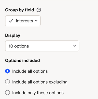
When grouping results in a Pie Chart report, you can choose from these options:
- Include all options: Shows all choices.
- Include all options excluding: Excludes specific options while including the rest. Useful if you only need to remove a few options.
- Include only these options: Shows only the options you specify. Ideal if you want to include just a few options and exclude the rest.
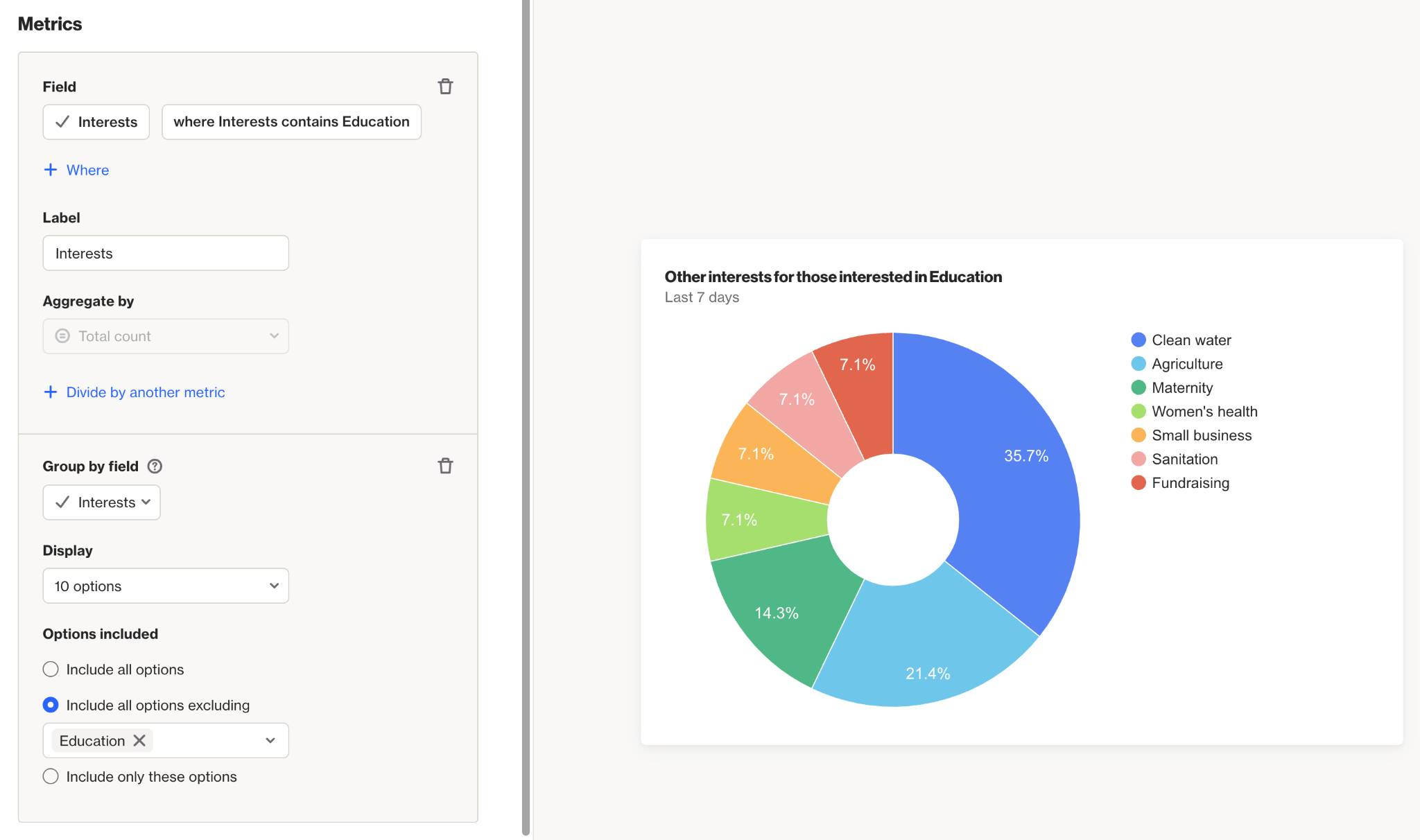
EX:
If you have a multi-select field called Interests and want to see other interests of people who are interested in Education:
- Set your Metric to Interests and add the condition where interests contains Education.
- Group the report by the Interests field.
- To exclude Education from the results (since everyone has it), choose Include all options excluding and enter Education.
The report will now display other interests of people who have Education listed.
Once configured, select Create to build the report on the account.
Below is a table of the available setting options for this report:
Setting | Description |
|---|---|
Report Name | Sets the internal name of the pie chart report, making it easy to identify in the reports list and dashboards. |
Add metric / Add another metric | Select the activity, contact field, or account field to use as a metric in the report. Learn more about field-based reports. |
+ Where | Add conditions to refine which activities or field values are included in the metric. |
Group by attribute or field | Controls which field or attribute is used to segment the pie chart. This setting is only available when using one metric. |
Label | Sets the name for the metric in the chart. |
Aggregate by | Choose how the metric is calculated: Total count or Unique total count. Metrics with number or currency attributes can also be aggregated by Sum or Average. |
Attribute for aggregate | When aggregating by Sum or Average, select the number or currency attribute to calculate. |
Associate by | When using Unique total count, select the attribute that determines how activities are counted as unique. Learn more about uniqueness. |
Divide by another metric | Divide one metric by another to calculate a rate or ratio. E.g. divide unique Opened Email by unique Received Email activities for an open rate. Learn more about campaign statistics. |
Display As | When dividing metrics, choose whether the result is displayed as a Rate (%) or a standard value. |
Filter results by | Apply additional filters to limit which contacts are included, such as audience membership, field values, or tags. |
Timeframe | Sets the date range for the report. Only activities within this window are included. |
Uniqueness Window | Determines how often the same contact can be counted for the same activity. This prevents duplicate activity events from inflating cohort results within a defined time period. Learn more about uniqueness windows. |
Chart display | Allows control over whether to display values, display as donut, display empty attribute values as unknown, and group remaining responses as 'others'. |
Exclusions | Allows you remove contacts in your suppression list from your report, such as internal users or test data, to keep your results clean and accurate. Learn more about the email suppression list. |
Interpreting pie chart reports
A pie chart report visualizes data as a set of segments that together represent a whole:
- Each slice represents a group of records based on the Group by setting, such as by campaign, activity type, or field value.
- The size of each slice is determined by the selected metric, such as a count, unique count, or aggregated field value.
- The full pie represents the total value of the metric across all included records.
Understanding the slices
Each slice in the pie represents a group of records that share the same attribute value defined by the Group by setting.
For example: grouping the Opened Email activity by Device creates one slice per device type.
NOTE: Slice colors are assigned based on relative size, not on the underlying attribute or field value. For example, the largest slice is always shown in blue. As a result, changing the report timeframe may cause the same value to appear in a different color.
Understanding the metric values
The metric used in a pie chart determines how each slice is sized relative to the others.
Depending on the configuration, the metric may represent:
- The total count of matching activities or records.
- A unique count, where each contact is counted once based on the selected association.
- A sum or average of a number or currency attribute.
- A rate or ratio when supported by the selected metric.
Reading the pie chart allows you to quickly compare the proportion each group contributes to the overall total.
NOTE: Reports are built using existing activity data. The data available in a report depends on each activity’s data retention settings. Learn more about data retention.
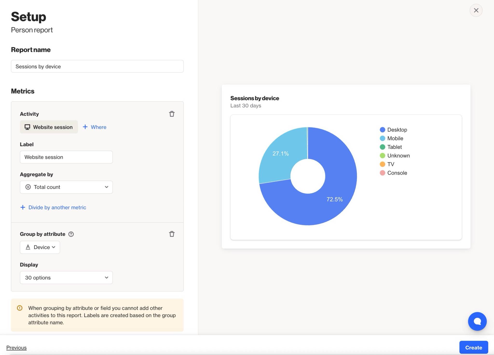
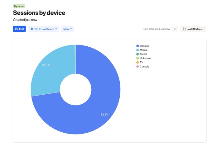
EX: This pie chart report indicates that in the last 30 days, 72.5% of the Website Session activities that occurred were on a desktop, 27.1% were on mobile, and the remainder were split across TV, console, or unknown when grouped by the Device attribute.