
Using table reports
Overview
Table reports provide a structured way to analyze campaign and journey performance by breaking activity data into rows and columns. They are typically used as supplemental reports to give you a detailed breakdown of the underlying activity data.
Table reports help you inspect exact counts, groupings, and attributes related to campaign interactions and contact behavior.
When to use a table report
You can use table reports when you need to review data across different activities, campaigns, or time.
Here are some example cases where a table report can be used:
- Break down campaign performance by message or campaign
- Review the activities of contacts within specific audiences
- Compare e-commerce or Talk conversation metrics
Creating table reports
You can create a table report by selecting Analytics > Reports > +New Person/Account Report > Start from scratch > Table report.
When building the report:
- Click + Add metric to select the activity you want to report on.
- Use the table below to configure the report's settings in the editor.
- Select Create to build the report on the account.
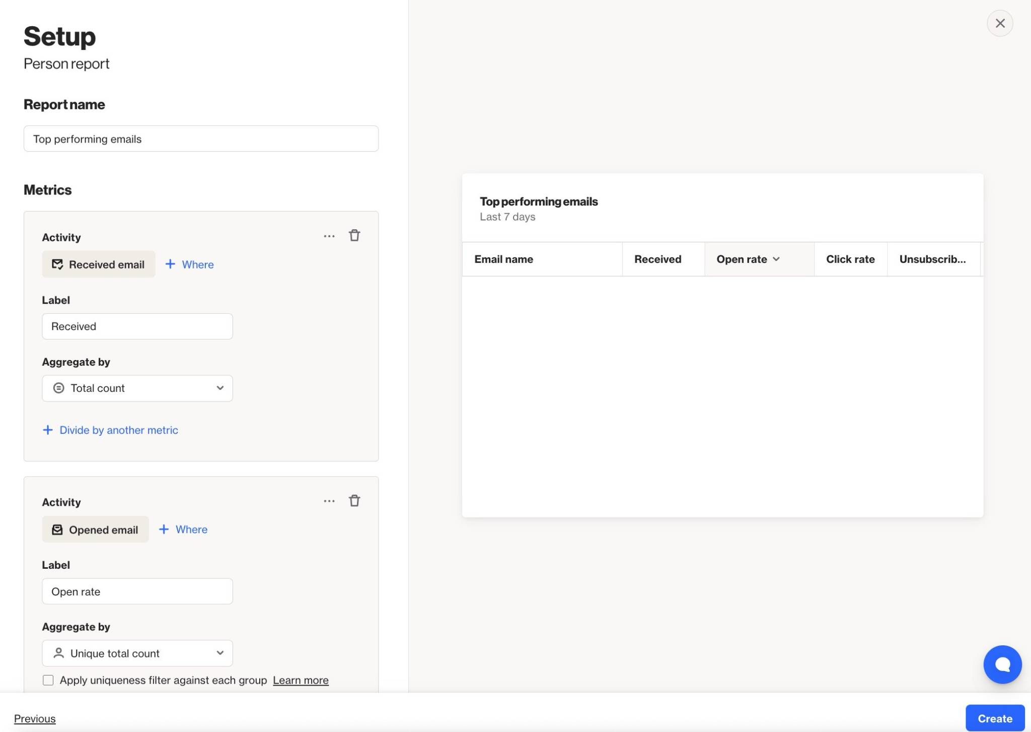
Below is a table of the available setting options for this report:
Setting | Description |
|---|---|
Report Name | Sets the internal name of the table report, making it easy to identify in the reports list and dashboards. |
Add metric / Add another metric | Select the activity, contact field, or account field to use as a metric in the report. Learn more about field-based reports. |
+ Where | Add conditions to refine which activities or field values are included in the metric. |
Label | Sets the column name for the metric in the table. |
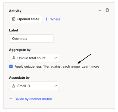
Aggregate by | Choose how the metric is calculated: Total count or Unique total count. Metrics with number or currency attributes can also be aggregated by Sum or Average. |
Attribute for aggregate | When aggregating by Sum or Average, select the number or currency attribute to calculate. |
Associate by | When using Unique total count, select the attribute that determines how activities are counted as unique. Learn more about uniqueness. |
Divide by another metric | Divide one metric by another to calculate a rate or ratio. E.g. divide unique Opened Email by unique Received Email activities for an open rate. Learn more about campaign statistics. |
Display As | When dividing metrics, choose whether the result is displayed as a Rate (%) or a standard value. |
Filter results by | Apply additional filters to limit which contacts are included, such as audience membership, field values, or tags. |
Group by | Define which attribute the metrics are grouped by in the table. |
Sort by | Choose which metric the table is sorted by and whether the order is ascending or descending. |
Timeframe | Sets the date range for the report. Only activities within this window are included. |
Precision | Defines the time unit used to group and display activity data in the report. |
Uniqueness Window | Determines how often the same contact can be counted for the same activity. This prevents duplicate activity events from inflating results within a defined time period. Learn more about uniqueness windows. |
Exclusions | Allows you remove contacts in your suppression list from your report, such as internal users or test contacts, to keep your results clean and accurate. Learn more about the email suppression list. |
TIP: When isolating a specific campaign using the + Where condition, apply the same condition to all metrics in the table to ensure the results are accurate and comparable.
Configuring uniqueness
When you create a table report with the Aggregate by option Unique total count, by default, the Apply uniqueness filter against each group checkbox is selected. This setting collects 1 activity event per person, per group (instead of 1 activity event per person across all groups).
For example, you have sent 5 different email campaigns to 1 person in 1 day. The recipient clicks each campaign, some more than once, resulting in 8 clicks across the 5 campaigns.
When you build a report for the activity Clicked email, grouped by Campaign name, the report will display 1 Clicked email activity event for each of the 5 different campaigns.
Without Apply uniqueness filter against each group selected, the report would only capture 1 of the Clicked email activity events, because our system will count the first event matching the activity metric then stop counting.
Interpreting table reports
A table report is displayed as a table made up of rows and columns:
- Each row represents a grouped set of records based on the Group by setting (for example, by date, campaign, or field value).
- Each column represents a metric added to the report, such as activity counts, unique counts, or aggregated field values.
- Each cell shows the calculated value for a specific metric within that row’s grouping.
Understanding the rows
Each row in the table represents a group of records that share the same attribute value defined by the Group by setting.
For example:
- Grouping by Day creates one row per day.
- Grouping by Campaign creates one row per campaign.
- Grouping by a field value creates one row per unique value of that field.
All metrics in the row are calculated only from the records that belong to that group.
Understanding the metric columns
Each metric column displays the calculated result for the selected activity or field, based on the aggregation options chosen when the metric was added.
Depending on the configuration, a metric may show:
- The total count of matching activities or records.
- The unique total count, where each contact is counted once based on the selected association.
- A sum or average of a number or currency attribute.
- A rate or ratio when the metric is divided by another metric.
Reading across a row allows you to compare how different metrics perform for the same group, while reading down a column allows you to compare the same metric across different groups.
NOTE: Reports are built using existing activity data. The data available in a report depends on each activity’s data retention settings. Learn more about data retention.
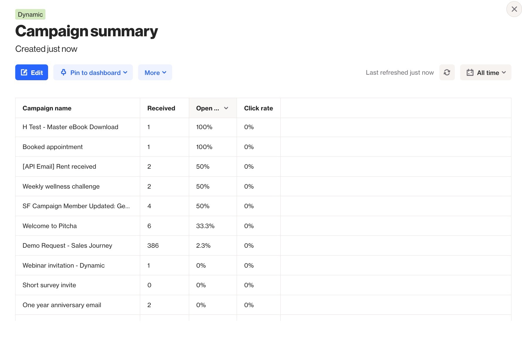
EX: This table report groups activities by the Campaign Name attribute and shows the total number of Received Email activities for that campaign as well as its open and click rates, sorted by Open rate.
The Booked appointment campaign had one Received Email activity, a 100% open rate, and a 0% click rate.