
Configuring a capture widget
Overview
After creating a capture widget, whether from a template or from scratch, you can edit its content, style, and settings. Most widgets share similar editing tools, but some, like embeddable form, tracked form, and spin the wheel, have unique options.
Accessing capture widget
To access capture widgets, navigate to Marketing > Capture.
Content editing
Content
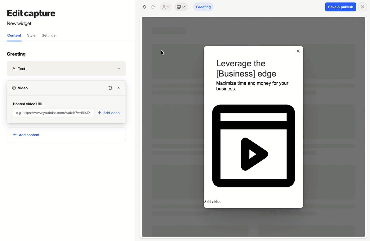
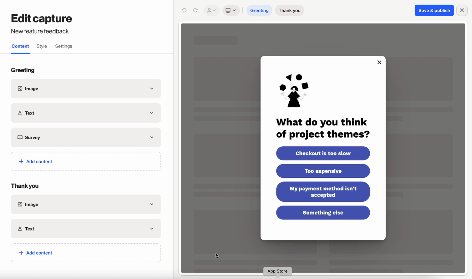
After creating a capture widget (from scratch or a template), click Edit on the widget details page to open the content editor.
The editor includes display components like Greeting and Thank you, which contain the messages and actions shown to visitors.
To edit content:
- Click a content component to expand or collapse it.
- Drag and drop components to reorder them.
- Click the trash can icon to delete a component.
- Click Add content to include new elements like:
- Text
- Button
- Form
- Coupon
- Image
- Video
- Reaction
- NPS
- Survey
- Countdown
These options may vary slightly depending on the widget type.
NOTE: When you add Form, Reaction, or Survey content components, a Thank you display component is automatically added. This allows you to show a message or offer (like a coupon) after the user completes the widget.
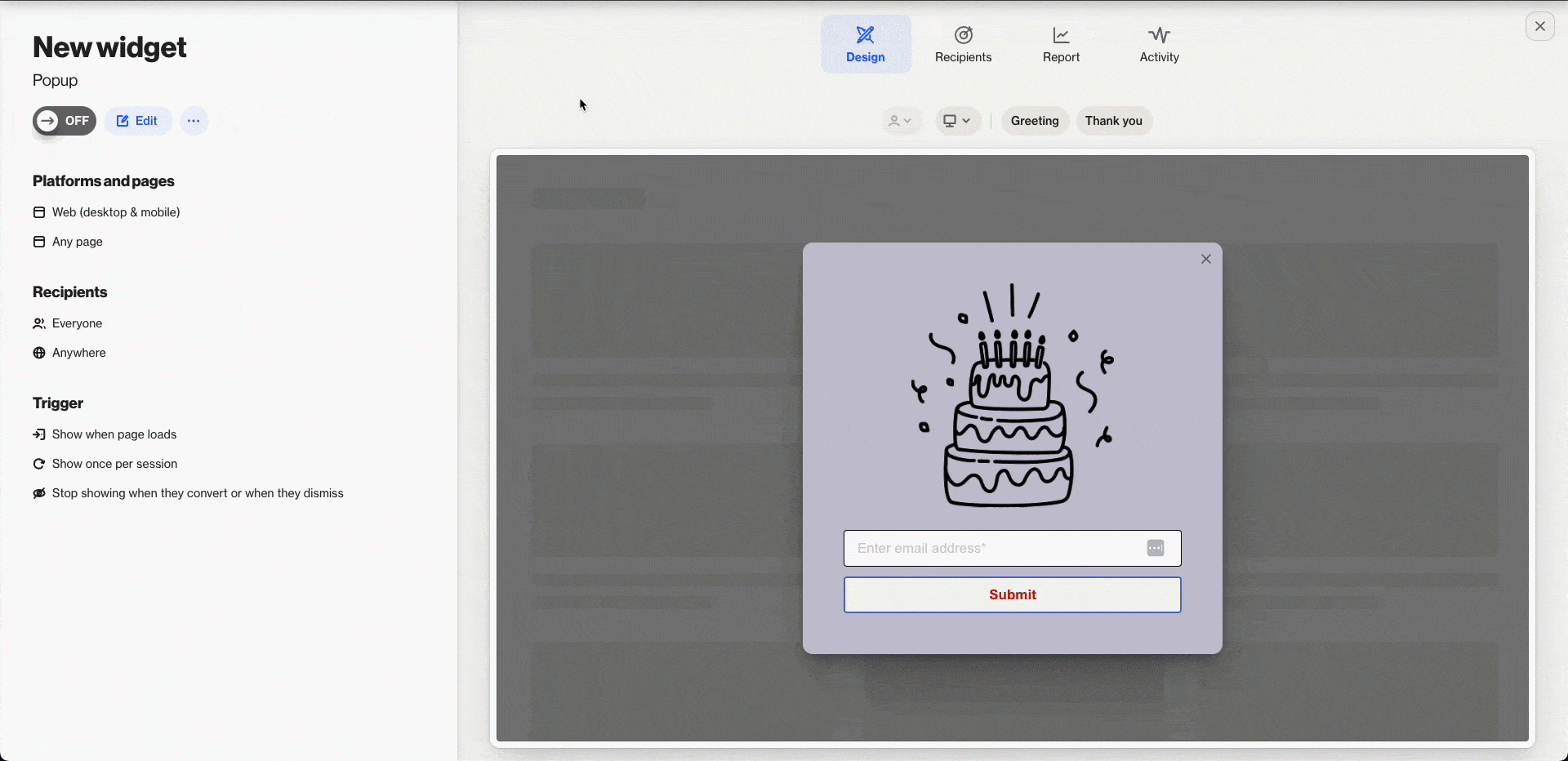
Use the preview on the right side of the screen to:
- See updates to your content in real time
- Switch between the Greeting and Thank you views
Go to the Style tab to customize the look and feel of your capture widget.
TIP: Click the merge tag icon to add merge tags to text and links.
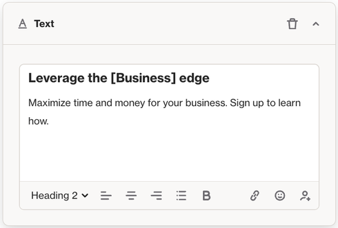
Text content block
The Text content block lets you add and customize text in your widget. Use it to display information, instructions, or any other written content to improve the visitor experience.
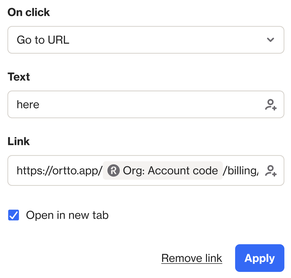
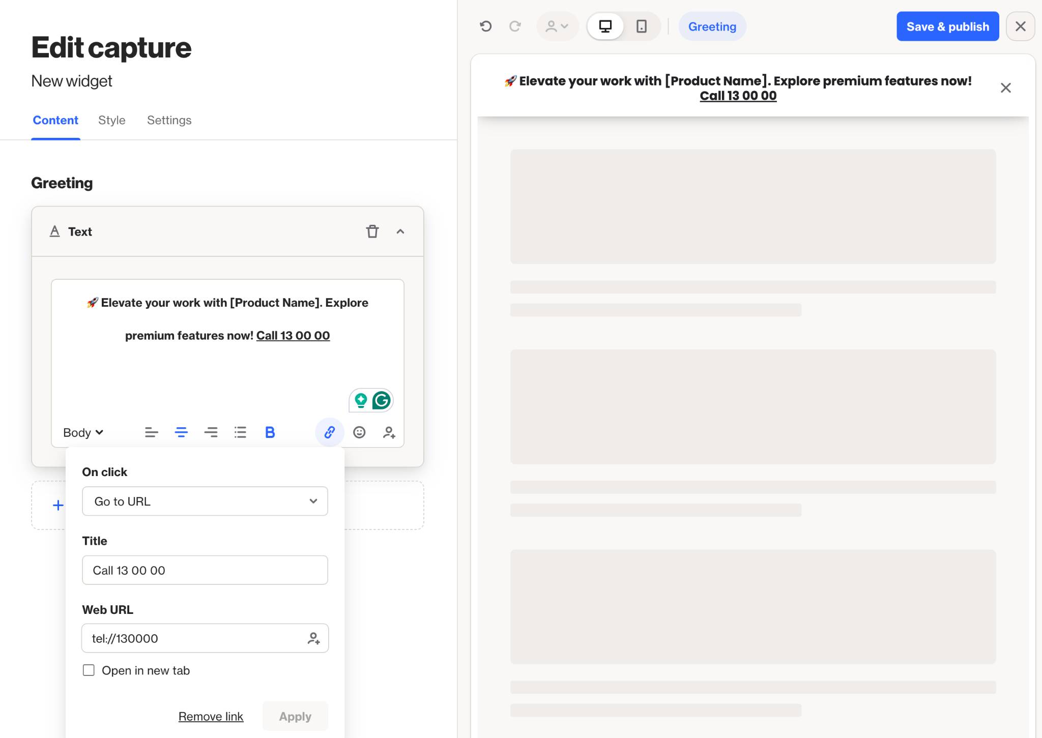
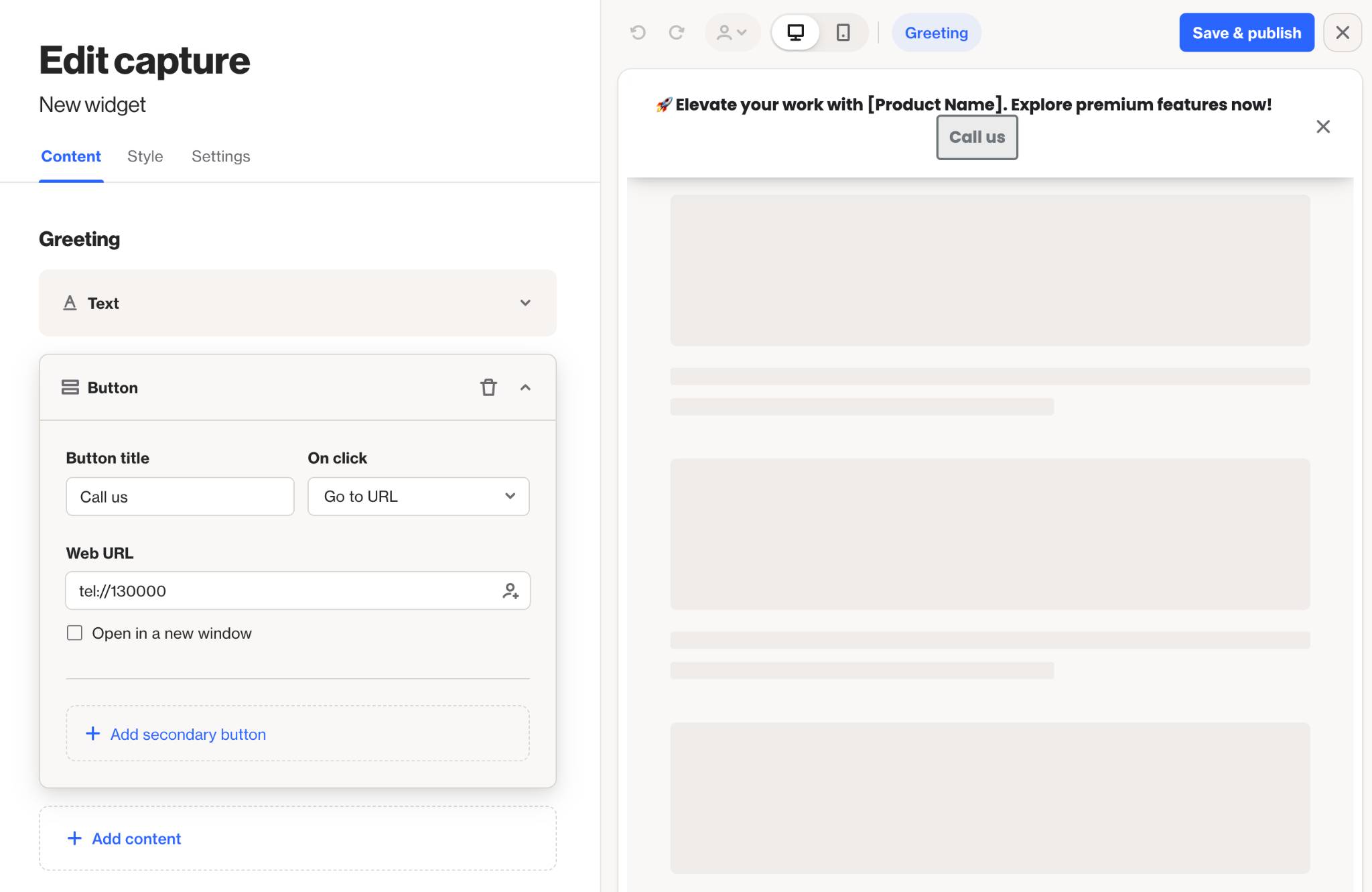
NOTE: All capture widgets have support with number-based actions in a text block with either tel:// or sms:// followed by the number.
- tel:// - Click to dial.
- sms:// - Click to message.
For e.g. tel://130000 will call 13 00 00.
This just needs to be configured on click with the Go to URL option.
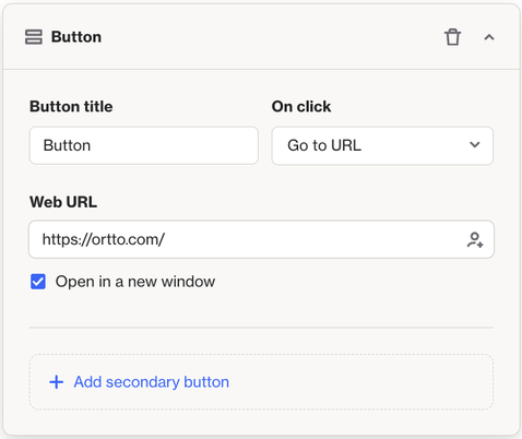
Button content block
The Button content block adds interactive buttons to your widget, allowing users to take actions. Each button has an On Click menu where you can set its behavior.
Supported actions include:
- Go to URL: Directs visitors to a web page
- Go to next step: Shows the thank-you view
- Accept cookies: Lets visitors accept your cookie policy
- Request push permission: Prompts for push notification access
- Close widget: Closes the widget
- Send email: Opens the visitor's email client
- Download file: Offers a downloadable file
You can also add a secondary button for more options.
TIP: You can use the Download file option to provide files to visitors when the click on that button.
Learn more about setting up file downloads in capture widgets.
NOTE: All capture widgets have support with number-based actions in a text block with either tel:// or sms:// followed by the number.
- tel:// - Click to dial.
- sms:// - Click to message.
For e.g. tel://130000 will call 13 00 00.
This just needs to be configured on click with the Go to URL option.
Form content block
The Form content block lets you collect contact submissions in your widget. You can include contact or account fields, and one unique identifier field is required.
To add more fields:
- Click Add field to include extra options.
- Choose + Create New to create a new field, either adding it to the form or creating a custom field in the CDP.
- Click the field name to customize how the data is managed.
Any contact who submits the form will be automatically subscribed to email marketing.
Learn more about how to pre-fill and hide form field data.
NOTE: A capture widget’s default find strategy is set to “any.” This means it checks multiple merge_by fields in sequence to determine whether a person already exists.
For example, if both email and phone are submitted in the capture form:
- The system first looks for a match using the email.
- If no match is found, it then tries the phone number.
- If neither field matches an existing record, a new person is created (based on the merge strategy).
In short, the “any” strategy attempts to match using any one of the provided identifiers, stopping as soon as a match is found.
TIP: To allow contacts to submit the form without being automatically subscribed, add the Email permission field. This adds a checkbox to your form, letting contacts choose to opt in to email marketing or remain unsubscribed.
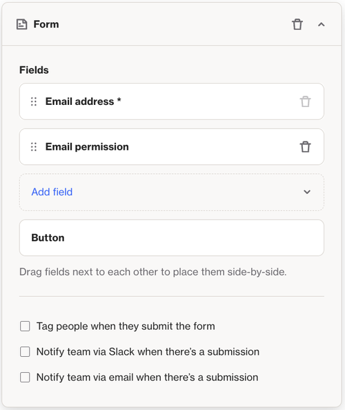
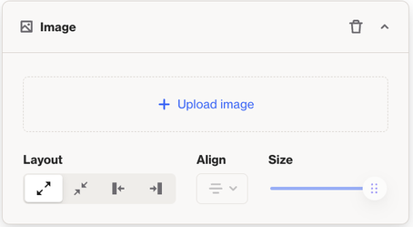
Image content block
The Image content block lets you add images to your widget. It supports PNG, JPG, GIF, and WEBP files. Use it to display visuals, logos, or graphics that enhance your widget’s design and message.
NOTE: Image must have a max width of 2048px and a max height of 2048px.
Video content block
The Video content block lets you embed videos from platforms like YouTube directly into your widget. Visitors can click the video to watch it within the widget.
To add a video:
- Paste the video URL into the Hosted video URL field.
- Click + Add video.
- Choose your preferred layout option.
If you want a custom thumbnail, click the + icon to upload an image.
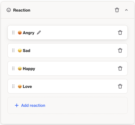
Reaction content block
The Reaction content block lets users interact with your widget using emoji reactions.
To customize:
- Click the pencil icon.
- Choose an emoji by clicking the emoji icon.
- Edit the label for the reaction in the text field.
- Click the checkmark to save.
This block is great for gathering quick feedback or adding a fun interactive element to your widget.
NOTE: This content block requires an emoji for each reaction. If you'd prefer not to use emojis, consider using a Survey content block instead.
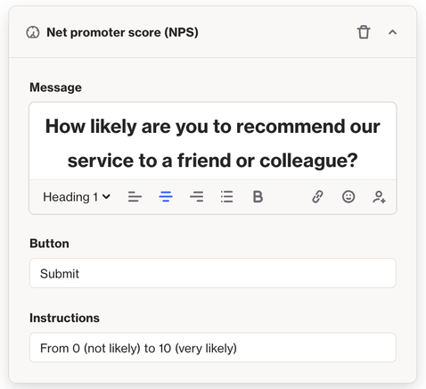
Net promoter score (NPS)
The NPS content block lets you gather feedback on a scale of 0 to 10 to measure satisfaction and loyalty.
You can customize:
- Message: Explain the purpose of the NPS survey
- Button text: Set the label for the submit button
- Instructions: Help users understand the scale (0 = lowest, 10 = highest)
It’s a great way to understand how users feel and improve their experience.
Survey content block
The Survey content block lets you collect feedback with customizable response options.
To set it up:
- Click the pencil icon to edit option labels
- Click Add response to include more choices
- Check Collect written responses to let users add a comment after selecting an option
This block is great for creating quick, engaging surveys.
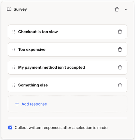
To show survey feedback in the Thank you message after submission, make sure the Collect written responses option is turned on.
NOTE:
If a person leaves feedback:
- Their feedback will appear as an attribute in the Responded to Widget Survey activity.
If a person does not leave feedback:
- The Responded to Widget Survey activity will appear in their activity feed after 5 minutes. This delay allows time for the person to submit feedback following their initial survey submission.
Regardless of whether feedback is submitted, the same person can only submit the same survey once every 16 minutes. This limit is intentional and helps prevent misuse, such as spam or duplicate submissions.
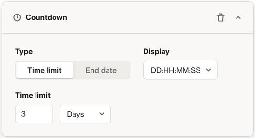
Countdown content block
The Countdown content block adds a timer to your widget to create urgency or excitement.
To set it up:
- Type: Choose how the countdown works
- Time limit: Counts down a set duration (days, hours, minutes, seconds)
- End date: Counts down to a specific date and time
- Display: Choose how the timer is formatted
Use this block to promote limited-time offers or upcoming events.
Style
To customize the look of your capture widget, go to the Edit capture page and click Style. Use the options on the left to adjust colors, fonts, and layout. A live preview appears on the right as you make changes.
Settings
The Settings tab lets you control where, when, and how your capture widget appears to users.
Use the options in the left-hand menu to set targeting rules and display behavior.
Widget display prioritization
By default, display prioritization is turned off. To enable or change it, go to Settings > Channels > Capture widgets.
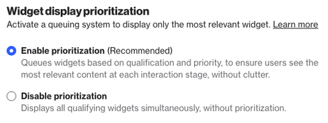
Once enabled, you can set a priority for each widget. This helps control which widget shows first, so users see the most relevant content without overwhelming their experience.
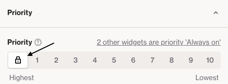
If the lock icon is selected, the widget will always display when its trigger rules are met—ignoring other widgets and their priorities.
Otherwise, you can set a priority from 1 (highest) to 10 (lowest). If other widgets share the same priority, a link will appear so you can view and manage them easily.
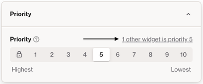
On the Capture overview page, you’ll see a column displaying the priority for each widget, so you can easily view it without opening each widget.
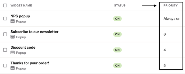
NOTE: If two or more widgets share the same priority, one will be randomly selected to display first. Journey widgets always take priority over regular capture widgets, even if the Journey widget has a lower priority number (i.e. priority 10 of a Journey widget will be displayed before priority 1 of a normal capture widget).
Learn more about journey widgets.
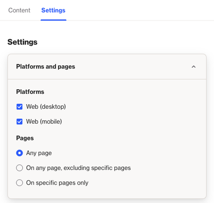
Platforms and pages
In this section you can select the platforms you want to display the capture widget on, including web (desktop and mobile), and, where available, Android and iOS applications.
NOTE: Currently, only popup type capture widgets can be configured for mobile applications.
After choosing the platforms for your widget, you can select which pages it will appear on. Options include:
- Any page
- All pages except specific ones
- Only specific pages
When you choose to exclude or specify pages, click the Add page link to define:
- Exact URLs to display or exclude the widget
- Pages that start or end with a specific URL
- Pages that contain or don’t contain a certain text string
IMPORTANT: If your website is a SPA (single-page application), please read about page exclusions in SPAs.
Recipients
In this section, set the rules determining who will see the capture widget.
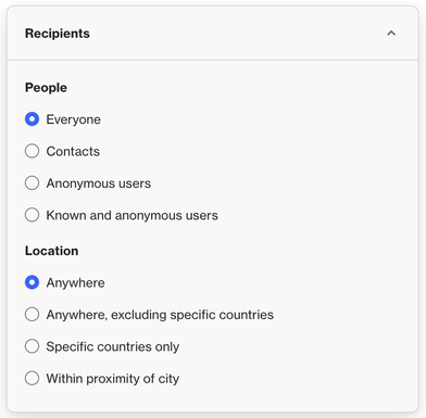
People lets you target who sees the capture widget based on the following options:
- Everyone: All visitors to your page will see the widget.
- Contacts: Visitors who are signed in or recognized as existing records in your CDP. You can add conditions to refine when the widget appears.
- Anonymous users: Visitors who are not signed in or identifiable in your CDP.
- Known and anonymous users: All visitors (both known and anonymous). As with the Contacts option, you can add conditions to refine when the widget appears.
Location lets you target users based on their geographical location, with options to show the widget:
- Anywhere
- Anywhere, excluding specific countries
- Specific countries only
- Within proximity of a city
Trigger
In this section, set the rules determining when visitors will see the capture widget.
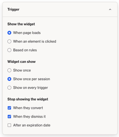
Show the widget lets you decide when the capture widget will appear, with these options:
- When page loads: The widget displays as soon as the page loads.
- When an element is clicked: The widget shows when a specific link or button (defined by an ID or class) is clicked. Enter the ID (#<id>) or class (.<class>) in the configuration box.
- Based on rules: Set conditions for when the widget will appear, with options to show it when any or all conditions are met.
For Display conditions, you can set a delay (up to 120 seconds), or choose options like scroll percentage or number of pages visited.
NOTE: The User shows exit intent option is only available when Desktop (Web) is the selected platform. If it's greyed out, adjust the selected platforms and pages to enable it.
At Widget can show, select the frequency at which the widget is shown to a visitor.
NOTE: For the Once per session option, a session ends when:
- The web browser is closed (Mac users must "Quit" the browser to clear the session cookie).
- Cookies are cleared, blocked, or modified by the user, which may affect tracking.
Once the session ends, the widget will not display again until the next session starts. If the user opens the page on a different browser or device, it counts as a new session.
NOTE: The tracking cookie for widget frequency expires after 365 days but is renewed when the visitor returns. If they don’t return within a year, the cookie expires.
Stop showing the widget lets you choose when the widget will no longer appear. The options are:
- When they convert
- When they dismiss it (click the X on the widget)
- Show only during/outside scheduled days and times (useful for aligning with hours of operation)
Once the specified time or action occurs, the widget will be turned off.
TIP: Widgets can also be scheduled to turn On and Off on specific dates. Learn more about scheduling widgets.
Attribution
Attribution helps you track which capture widgets drive conversions. In this section, you can set the activity that will count as a conversion for the widget.
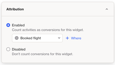
Go to Settings > Attribution to set the touch trigger for capture widgets. By default, it’s set to Shown, but you can change it to Engaged.
- Shown: A touch is counted when the capture widget is displayed to a contact.
- Engaged: A touch is counted when a contact interacts with the widget, such as watching a video, clicking a button, or submitting a form.
Learn more about attribution and touch triggers.
Page exclusions in SPAs (single-page applications)
In SPAs, you may notice that widgets set to be excluded from certain pages remain visible when navigating to those pages. This happens if the widget appears on one page and the visitor moves to an excluded page without dismissing it. The widget will continue to display, even though it should be hidden.
To address this, we have implemented a JavaScript command: ap3c._generalWidget.hideAllWidgets()
By using this command when a user changes pages in the SPA, all widgets will close. The relevant widgets will then reload on the new page, ensuring proper page exclusions are applied.