
Creating a new report
You can create a new Ortto report either from an existing template or from scratch.
Creating from a template
To create a new Ortto report from a template:
1. On the Reports page, click New report.
2. Select whether you want a person report, or an account report.
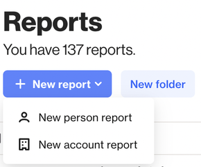
TIP: Select person report if you want to report on contact-level activities or fields. Select account report if you want to report on account-level activities or fields.
Learn more about account activities.
5. Select a template based on a particular use case or data source integration as the basis to build your report. You can also select previously Saved templates or choose from templates shared with you from another Ortto account under Shared with me.
6. When you choose a template, click Use template to get started. If the template you selected uses data from a connected data source, you’ll need to choose the relevant accounts. Once selected, you can also rename the report if needed.
7. The report will be pre-configured and shown as a preview of the last 30 days.
TIP: If you're interested in creating a custom report for a campaign, you can use the "Email Campaign Summary" template as a starting point for the metrics and make edits to the activities to isolate specific campaigns as needed.
Creating from scratch with multiple activities
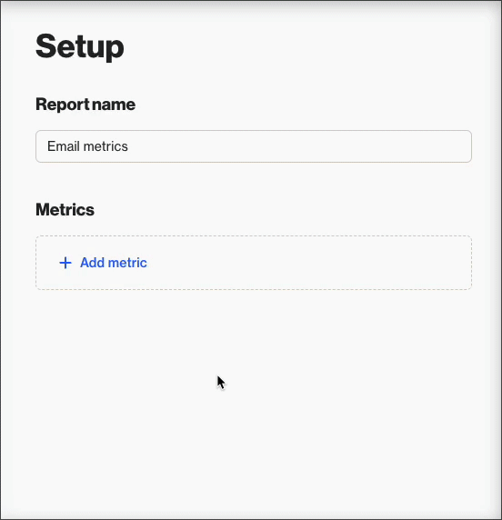
To create a new Ortto report from scratch (with multiple activities):
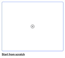
- On the Reports page, click New report > person/account report > Start from scratch.
- Select a report type then click Next. This example will teach you about column charts.
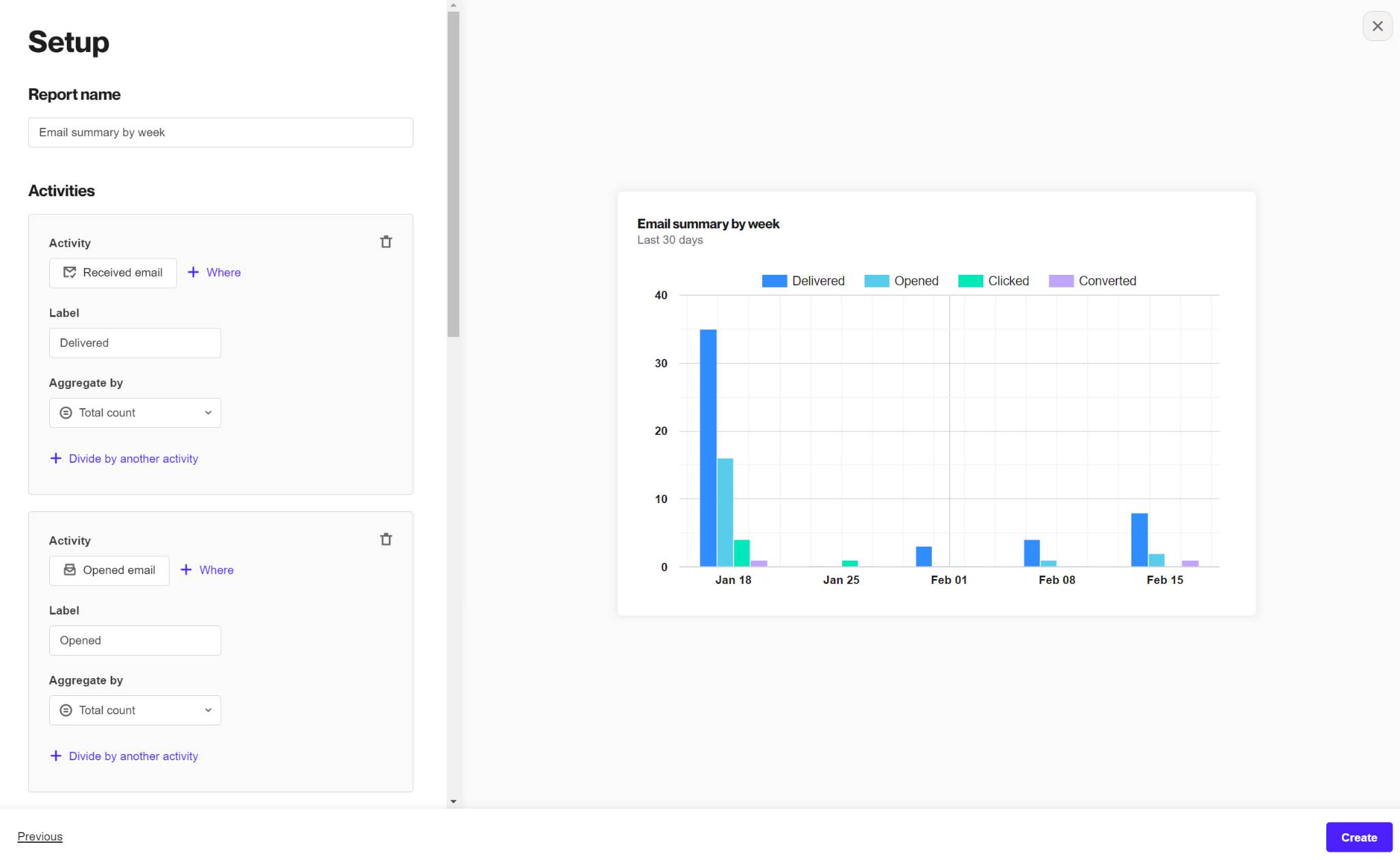
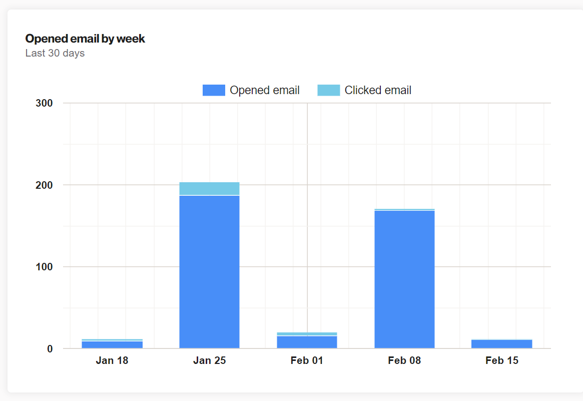
- Name your report something memorable. The convention we typically follow is the activity followed by the precision of the report. For example if you were looking at how many times your emails were opened each week this report would be named "Opened emails by week".
- Select an activity to see data display on the column chart. In this example we will select Opened email.
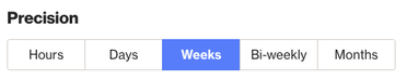
- Next we want to change the precision to Weeks.
- Let’s add a second activity to compare. We will select Clicked email as our second activity.
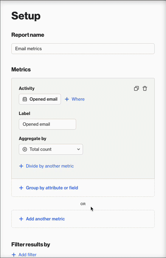
- Under Chart options you can display the activities as "stacked" to compare them in the same column. This is useful for when you have multiple activities.
Types of reports
Ortto provides two types of reports: snapshot and dynamic. Learn more about the types of reports.
Creating a field-based report
Creating a field-based report enables you to see how many users have a certain value for a custom, system or data source field on a particular day, week or month so you can track relative group sizes over time.
Using field metrics is available in pie, metric, line, table, area, column, and geo chart report types.
Learn more about creating a field-based report.
Uniqueness window
When you create a report with the Aggregate by option Unique total count, you are able determine the Uniqueness window. The uniqueness window enables you to choose the window in which the report captures unique contact activities (for the timeframe of your report).
Learn more about the uniqueness window.
Note: The email open activity is automatically de-duplicated by 1 per 30 days per email sent. This means that for each email sent to a contact, the system will only count one open per 30-day period, regardless of how many times the contact actually opens the email.
Aggregate by
The Aggregate by setting is used to determine how activities ought to be counted.
- Total count: Provides a sum of the total number of activities that occurred.
- Unique total count: Provides a sum of the unique contacts that have had the activity occur. This means if an activity occurs for a contact more than once, it will only count once.
When using Unique total count, there will also be an Associate by setting that will become available. This Associate by setting is used to determine how an activity is identified as unique.
TIP: A new report's default settings have the Associate by set to Person as the unique count, which means a contact can only have one activity counted for that metric.
When creating a report based on an email activity, if there are contacts who receive more than one email, it's recommended to use the Email ID for the Associate by for a measure that is reflective of the sending volume.
Uniqueness filter for table reports
When you create a table report with the Aggregate by option Unique total count, by default, the Apply uniqueness filter against each group checkbox is selected. This setting collects 1 activity event per person, per group (instead of 1 activity event per person across all groups).
Learn more about the uniqueness filter for table reports.
Report timeframes
You can find a list of the report Timeframe options, including a description of how each timeframe is calculated, in Report timeframes.
Chart options
The following table details by report type the chart options available when you create a report from a template or from scratch.
Chart option | Report type | Description (This option…) |
|---|---|---|
Compare to previous period if available | Line graph, metric | Displays data from a previous period (if available) so you can compare the previous and current results. |
Display values | Funnel, pie chart, line graph, area chart, column chart | Displays the data total count value instead of a percentage. |
Display as donut | Pie chart | Shows the data in a donut shape instead of a solid circle. |
Display empty values as unknown | Pie, line graph, area chart, column chart | Labels empty attribute values as "unknown". |
Exclude members of suppression filter | All | Is automatically selected if you have a Report suppression filter enabled in your account Settings (under Customer data). If you do not have a report suppression filter enabled, this option will not be available to select. |
Show cumulative data | Column chart, line graph, area chart | Displays the total amount of data that’s been gathered over a period of time. |
Show trendline | Line graph, area chart, column chart | Shows a straight line identifying the overall trend direction for a metric. |
Stacked values | Column chart | Displays data stacked in the same relevant column for the time period, instead of side-by-side. |
Bi-weekly precision | Line graph, column chart | Displays data for 2 week-long time units. |