
Creating an article
To create a new article in your knowledge base, on the Articles page, click New article and you’ll be taken to the article editor.
The article editor is a WYSIWYG (what you see is what you get) type editor so you can easily see how your article will look when it’s published.
This page describes the key elements of creating a knowledge base article, including some content and formatting tips.
Title and description
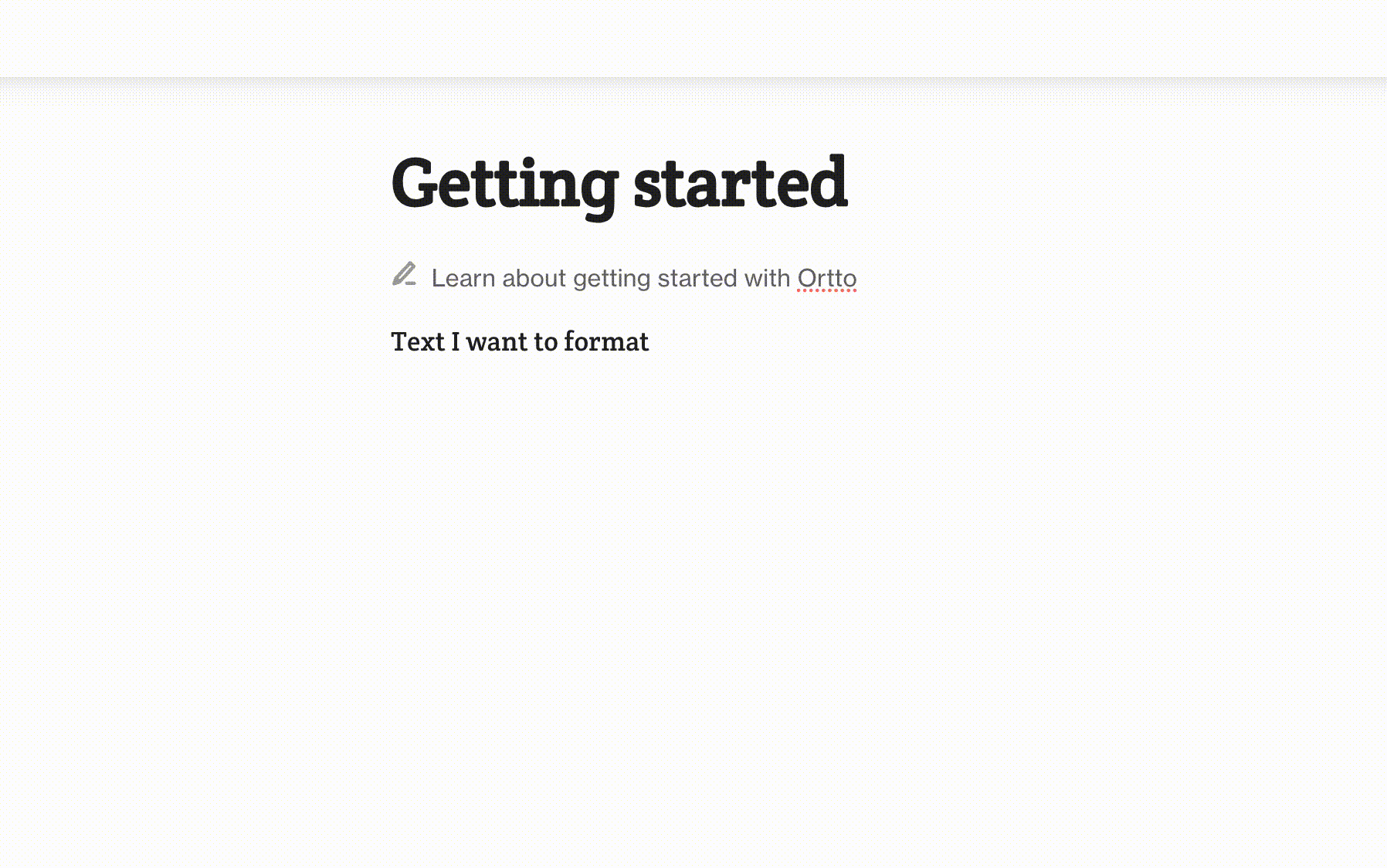
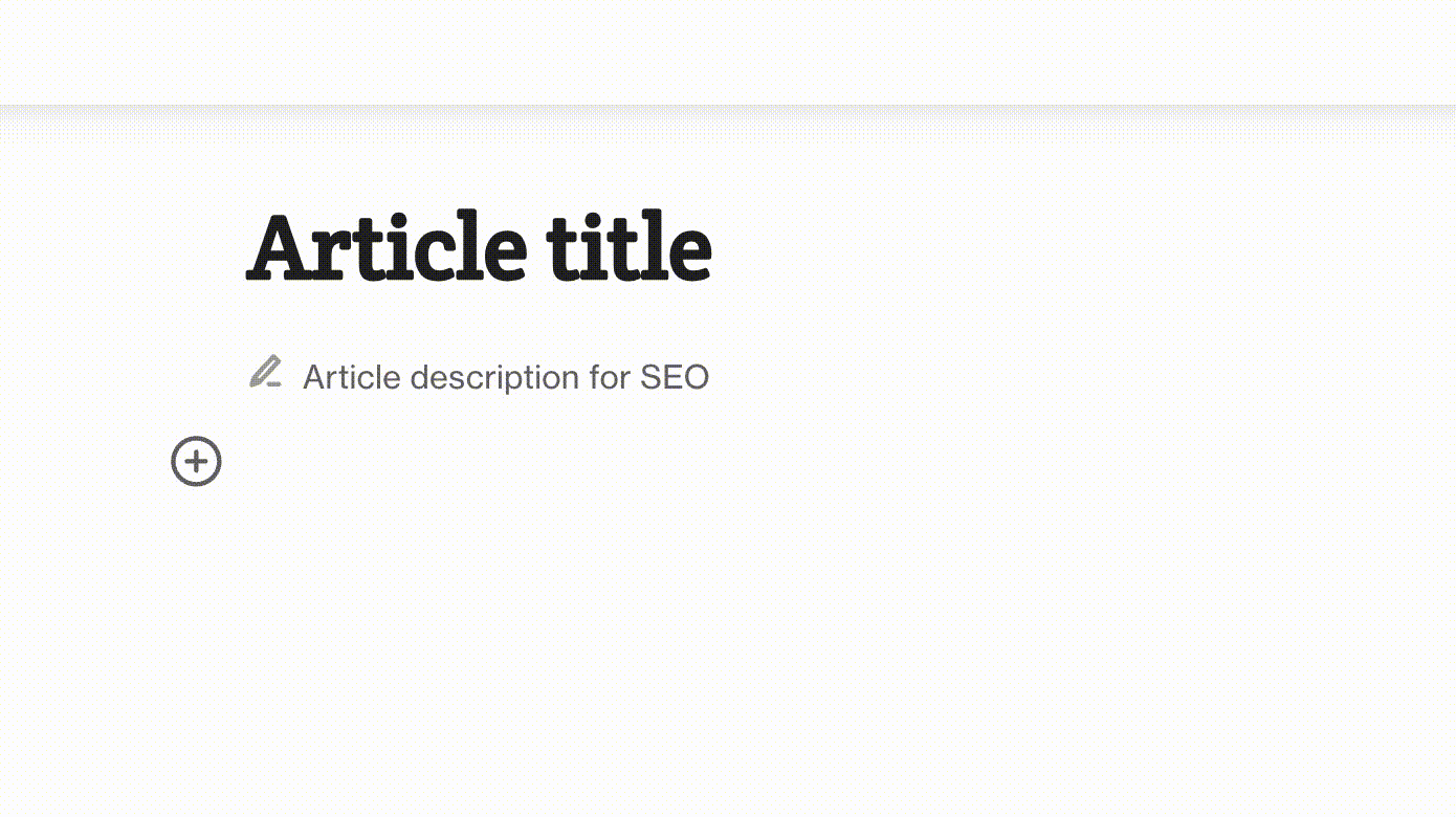
To start, add a descriptive title. The title you create will become the slug part of the URL for your article, for example: https://help.ortto.com/getting-started.
Then, add a description for your article. The description won’t be shown in your article when it’s published, because it’s used for search engine optimization (SEO) purposes.
The description should provide a clear overview of what the article is about so a user knows if the article contains the information they’re looking for. Learn more about article SEO below.
Article body and content
Write the body of your article in the editor.
Double-click on the text to access formatting options, including headings, alignment, and to add a link. Learn more about text formatting below.
Click the add icon (+) to access a menu of content components to insert, which are described below.
Image
Upload an image, or drag and drop an image, to add it to your article.
The supported image types are: .jpeg, .gif, .png, .webp, .tiff, .tif, and .bmp.
Video
Input the link to a video hosted on YouTube, Vimeo, Loom, or LiLiCAST.
If you'd like to request support for a video provider not listed here, please get in touch with our team by starting a conversation or emailing help@ortto.com.
File
Upload a file, or drag and drop a file, to add it to your article.
The supported file types are: .pdf, .csv, .txt, .doc, .docx, .xls, and .xlsx.
Table
Click the + icons to add columns and rows. Toggle on/off header columns and rows. Click and drag borders to resize columns and rows.
Callout
Ideal for adding admonitions for which you can specify the type using text and color.
For example, you could use blue for a NOTE, green for a TIP, and red for important information or a WARNING.
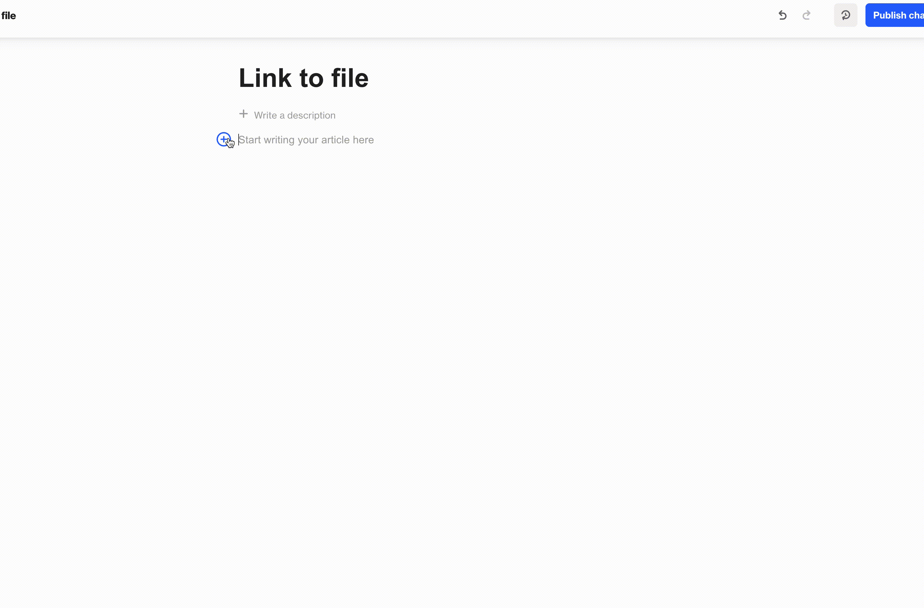
Button
Ideal for a call-to-action. You can configure the button to send people to a link or to a file.
The supported file types are: .pdf, .csv, .txt, .doc, .docx, .xls, and .xlsx.
Set the position as required using the alignment options.
Code
Add blocks of code and create syntax highlighting by choosing the relevant language from the drop-down option.
Accordion
Allow users to show/hide content they want to read.
Accordions are ideal for containing content which is relevant for different users, for example, placing region-specific information within different accordions.
Divider
These help to visually separate content into themes, hierarchies, or sections.
Text formatting
The text formatting options (e.g. bold, italics, link, add file, list) are shown when you highlight some or all of the text you want to format.
In addition to using the formatting menu options, you can use some basic Markdown syntax to create different heading levels, blockquotes, and ordered and unordered lists.
For example, to create headings, use a relevant number of # symbols before the heading text:
- # Heading 1,
- ## Heading 2,
- ### Heading 3, and so on.
A blockquote is created by preceding the text with a >. To escape the blockquote formatting, press the down arrow on your keyboard to start a new line.
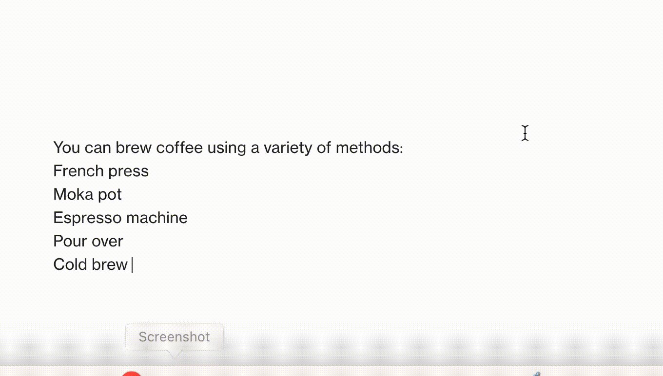
Create lists like so:
- Use
*, or-for unordered list items. For example:- * Item 1
- * Item 2
- * Item 3, and so on
- Use numbers for ordered list items. For example:
- 1. Item 1,
- 2. Item 2,
- 3. Item 3, and so on
In a list, create multi-level or indented list items by clicking the Tab key on your keyboard (or Shift+Tab to un-indent an item).

Link to a file
You can create links to files in a number of ways:
- As an inline text element:
- Select (e.g. by highlighting or double-clicking) the text you want to add a link to.
- Select the file upload icon.
- Select your file, then click "Open" to add it.
- Using a button component:
- Click the add icon (+) to access the component menu. Select Button.
- Type the button text.
- Click the file icon.
- Select your file, then click "Open" to add it.
- Using a file component:
- Click the add icon (+) to access the component menu. Select File.
- Select your file, then click "Open" to add it.
When clicked, a file will either open in a new browser tab or will automatically download, depending on the file type.
The supported file types are: .pdf, .csv, .txt, .doc, .docx, .xls, and .xlsx.
Undo and redo
Undo and redo actions are available at the top-right of the article editor.
You can also use keyboard shortcuts:
- Undo:
Cmd+Z/Ctrl+Z - Redo:
Shift+Cmd+Y/Ctrl+Y
Version history
Click the version history icon in the top-right corner of an article to access a list of the article’s versions.
When you click on a particular version of an article. Having Show changes in article selected will enable you to see the differences from the current version highlighted in green (for additions) and red (for deletions). You’ll then have the option to restore the current version to the selected version.
Heading anchor links
Each heading in an article has an anchor link which you can use to reference in your text.
To capture a heading's anchor link:
- Click in or next to the heading.
- When the link icon appears, click it and the anchor link will be copied.
- Select the text you want to link to the heading:
- Click the link option in the formatting menu.
- Paste the anchor link.
- Click the link icon to save the link.
Publish an article
Once you’ve finished creating your article, click Publish changes.
When you’re ready to show the article in your knowledge base, exit the editor to return to the article view. Then switch the article ON.